Back to home
Activity Timeline: engagement you can read
The activity timeline is where a rep goes to understand a relationship. Every call, email, meeting, and update is in one place. It should answer one question fast: are we building momentum with this account, or losing it? The problem was that you could not tell without scrolling through hundreds of events, because the important signals were buried in noise.

Problem
Engagement was buried under system noise. Reps had to scroll through hundreds of events to understand if a buyer was actually engaging.
The feed mixed two fundamentally different kinds of information: human engagement, like emails opened, calls answered, and meetings booked, alongside raw system updates, timestamps, and custom-field changes. Even the meaningful events were hard to scan, with full email bodies and repeated auto-generated text adding more noise.

Process
So I rebuilt it to be read top-down, not scrolled.
Separate signal from noise.
Three lanes: Engagement, Signals, and System logs.
Lead with the answer.
An AI summary on top, so the conclusion comes first.
Show the shape.
Seller and buyer side by side, and a bubble chart you read at a glance.

Solution
A timeline that gives you the answer first, shows the relationship at a glance, and keeps raw events for when you need them.
I designed the experience in layers. It opens with an AI-written summary of the account’s engagement state and why it is changing, so reps get the conclusion before reading the evidence. Below that, seller and buyer activity sit side by side, making it easy to see whether there is real momentum or just a one-way conversation.
I explored more precise ways to visualize engagement over time, from activity counts to detailed charts, but they all created the same trade-off: the more accurate the visualization, the more effort it took to interpret. For a rep checking an account seconds before a call, that was the wrong cost. The final design prioritizes the shape of the relationship at a glance, with the underlying events still there when deeper context is needed.

Impact
The bar it is measured against: a rep understands where a relationship stands from the top of the page, without scrolling a feed to guess.
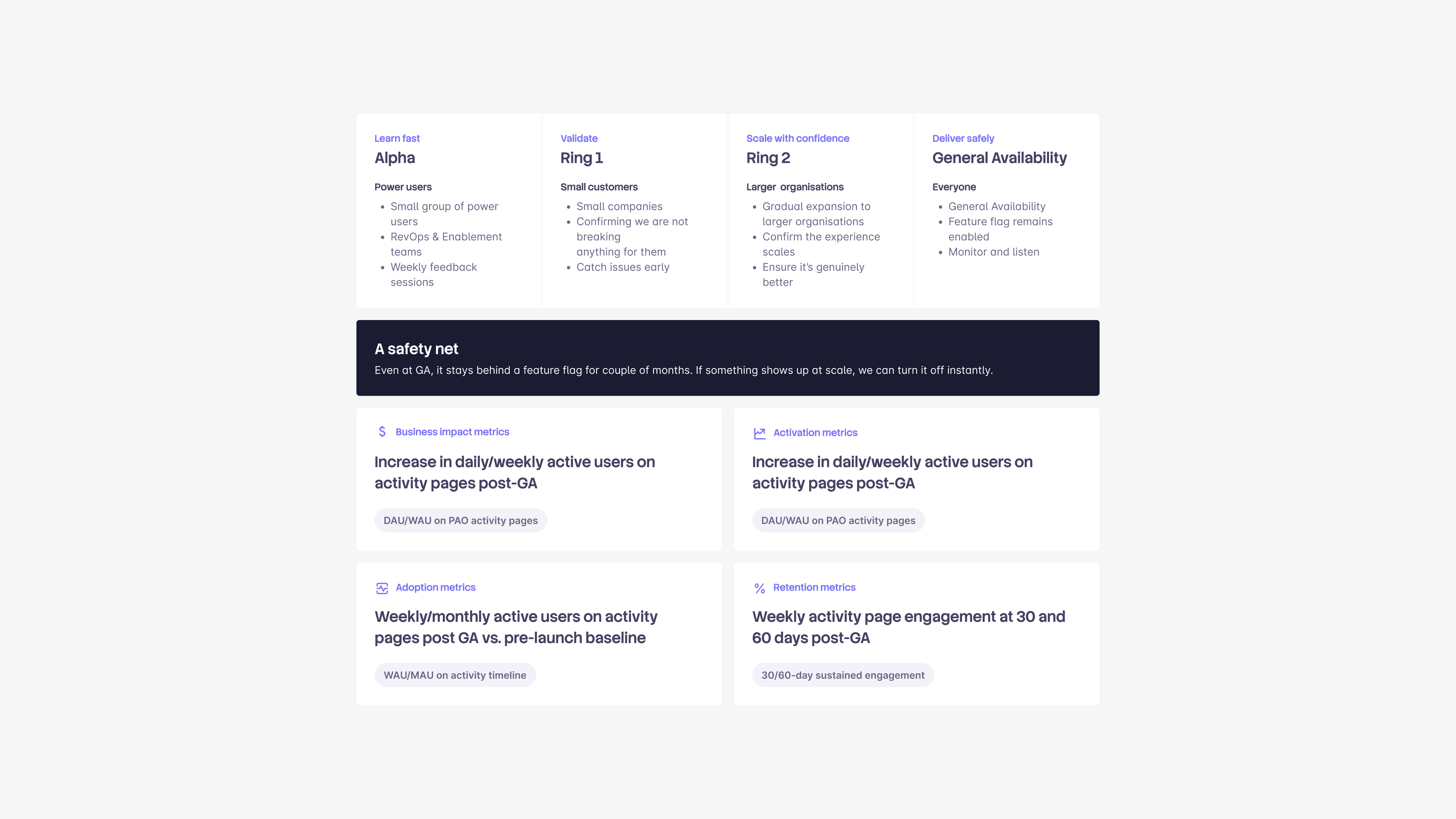
Implementation is still in progress, so there are no live impact numbers yet. We are validating carefully: first with power users in their real instances, then through a staged customer rollout, with a feature-flag safety net as adoption widens.
Once we have a post-launch baseline, we will measure whether the redesign earns its place through activation, adoption, and 30/60-day retention, alongside increased day-to-day use of activity pages. The simplest test sits underneath all of them: can a rep understand how the relationship is doing in seconds?