Back to home
Account experience: designed for the AI era
The account page is where a rep goes to understand a company: who is engaged, what is at risk, and what to do next. Over the years, it had slowly become the place where everything was added. Every new feature, and every new AI capability, arrived as one more tile, and no one owned the page as a whole. By 2026 it showed. And underneath the clutter, two completely different jobs were competing for the same screen.
Problem
One screen was doing two different jobs: helping sellers understand an account now, while planning what to do with it next. AI only added more noise.
The Account Overview had gradually become a collection of disconnected widgets: company news, weather, static CRM data, and increasingly, standalone AI cards exposing raw model output and long walls of generated text. Sellers had plenty of information, but still had to piece together the answer to the question that mattered: what should I know about this account right now?
The deeper issue was structural. The Account Plan had been embedded into the Overview to work around a technical constraint, forcing a quick pre-call scan and a long-term planning workspace onto the same surface. My hypothesis was to separate them: let the Overview explain the current state of the relationship, and let the Account Plan support long-term strategy.

Process
The job was not to remove AI. It was to design the missing layer between the model and the rep.
Design the human layer over AI.
Turn raw model output into a structured summary, not an essay in a tile.
Split the two jobs.
Give planning its own home, and keep the Overview for the fast scan.
Rank by the ten-second rule.
If a rep does not need it in the first ten seconds, it loses its place near the top.

Solution: Account Overview
An Overview you read in seconds.
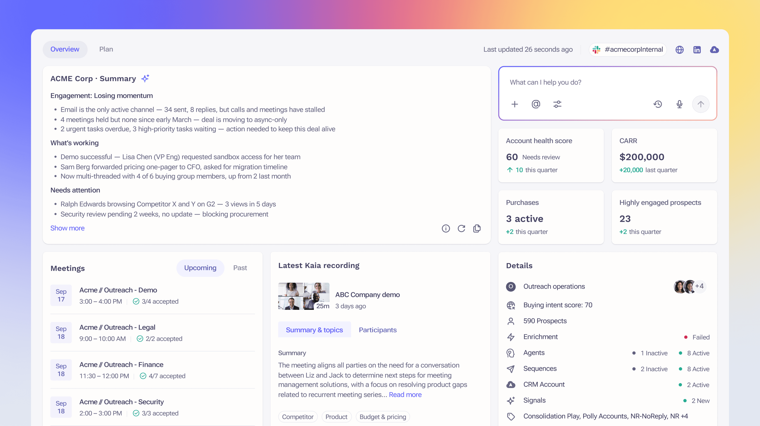
The redesigned Overview leads with the structured account summary. Then comes a short row of the few metrics that actually matter (health score, CARR, engagement, highly engaged prospects), and a prioritized list of suggested actions, where every item shows the reason behind it. Below that, a seller vs. buyer engagement chart shows at a glance whether engagement goes both ways, with the buying group and relationship map close by. The in-app AI assistant sits in the side panel, ready when you need it, instead of being one more essay in the feed.

Solution: Account Plan
Plan that finally reads like a plan, not a wall of tiles.
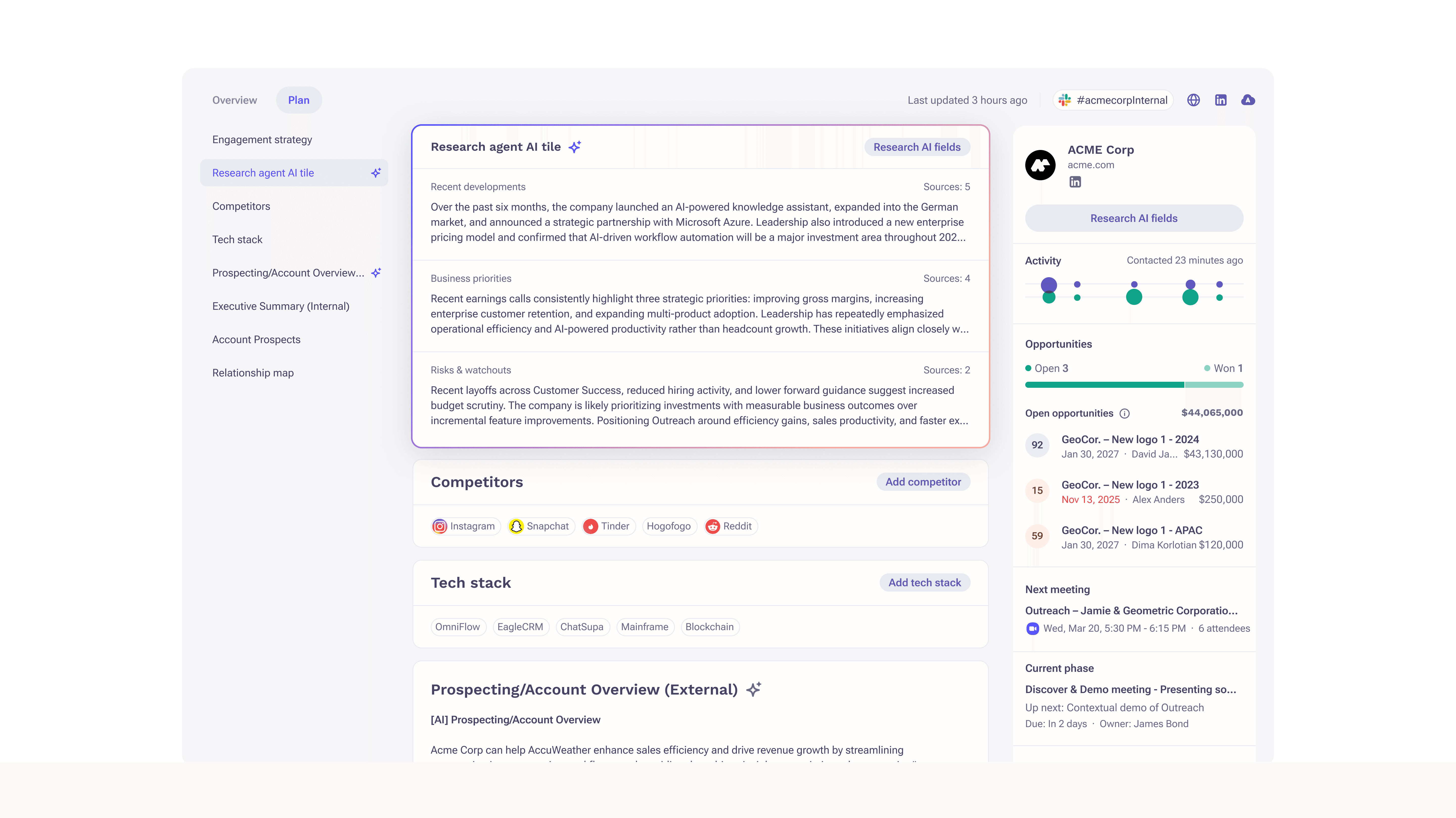
Planning got its own home: a single-column, document-like Account Plan with section navigation on the left (engagement strategy, AI-researched fields, executive summary, competitors, tech stack, prospects, relationship map). Click a section, and you jump to it. The same AI content that was an unreadable wall on the old page is shown here as clean, separated fields that you can actually maintain. It reads like a living document, not a form, and that is the whole point of giving planning its own surface.
Impact
The bar the page is now built around: a rep gets the state of an account in the first ten seconds, instead of digging through clutter.
In progress, so no numbers yet. We are validating it first, an alpha with power users plus dedicated RevOps and Enablement sessions, a ringed rollout, and a feature-flag safety net, then tracking NPS, Overview adoption, and time to first action.
